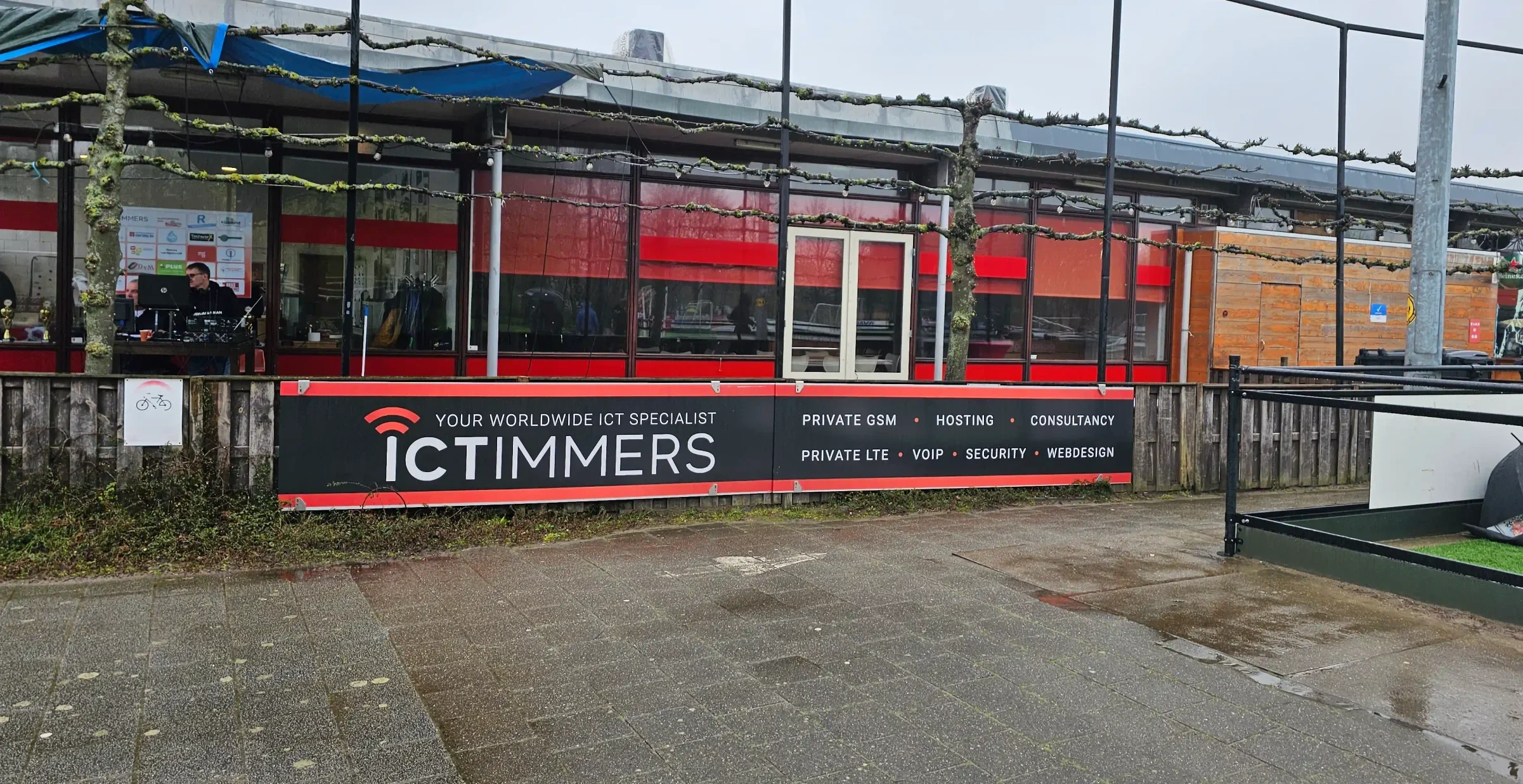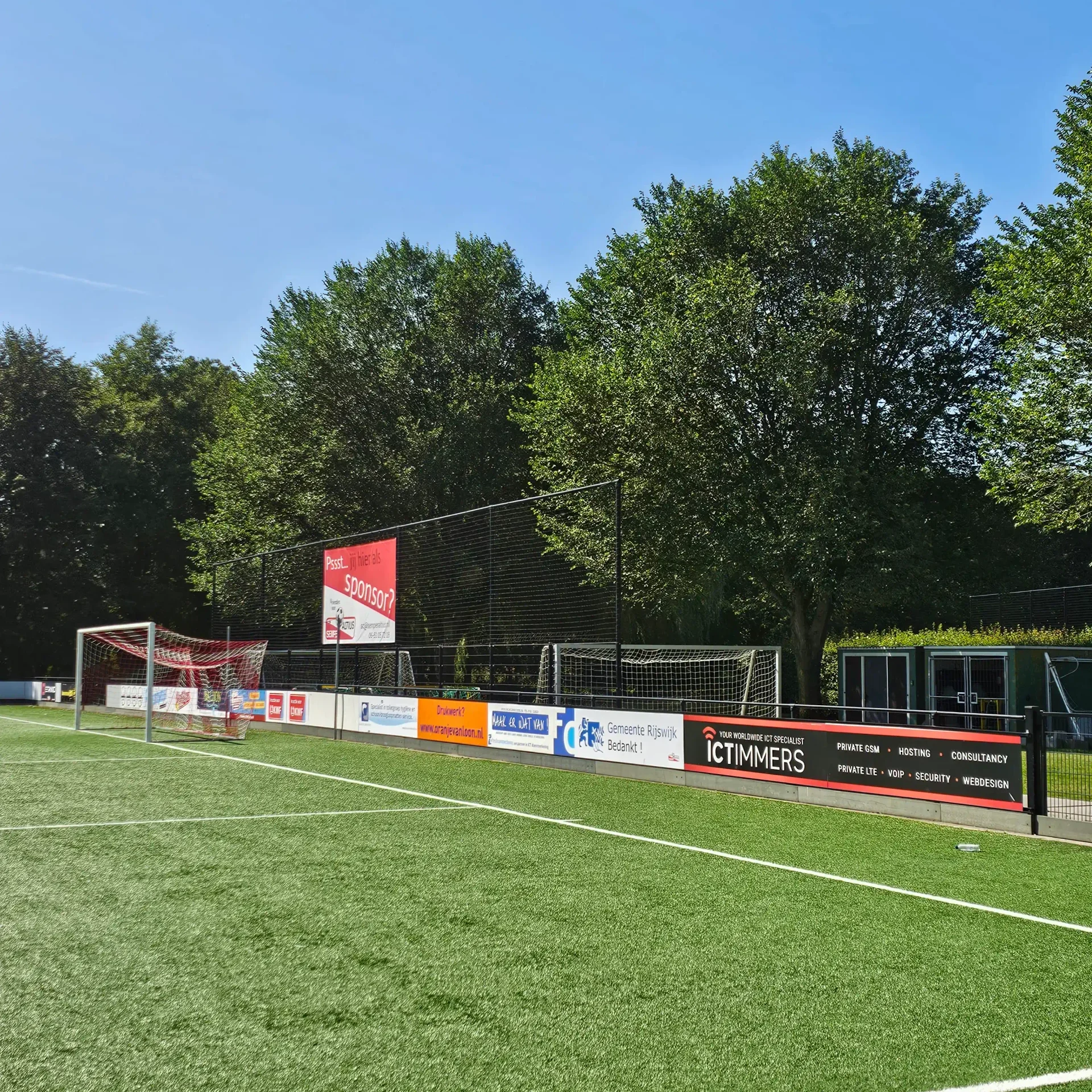
I had the opportunity to design the advertising boards alongside the football pitches as an internal project for the company. Together with the stakeholders I wrote down the core elements needed to be featured on the boards. Since most pitch-side boards contain a lot of white and light colors, I felt it was a smart move to utilize red and black, colors fitting corporate identity of the company, to make the boards stand out even more. Furthermore, as such advertising boards often tend to be cluttered with information, I decided to display only key words, ensuring the boards are easy to take in at a short glance.